Combining Color and Texture for a Dynamic Dining Room
When designing a dining room, the interplay between color and texture can transform a functional space into one that feels layered and inviting. Bold paint colors alone can make a statement, but adding textured wallpaper introduces a tactile dimension that alters how light and shadow interact within the room. This approach is not about following strict rules but rather about exploring combinations that feel balanced and intentional. By considering how different finishes and materials work together, it becomes possible to create a dining area that reflects a personal aesthetic while remaining practical for everyday use.
The dining room often serves as a gathering place for meals and conversations, making its visual and sensory qualities important. Neutral palettes have long been a safe choice, yet many homeowners are now looking for ways to incorporate richer hues and more complex surfaces. Combining a bold paint color with a textured wallpaper offers a path to achieve depth without overwhelming the space. The key lies in understanding how each element contributes to the overall atmosphere and in making selections that complement rather than compete with one another.
This article outlines a process-oriented approach to pairing paint and wallpaper, along with suggestions for table settings and centerpieces that tie the look together. The goal is to provide a framework for experimentation, allowing each person to adapt these ideas to their own space and preferences.
Understanding the Role of Color in the Dining Room
Color sets the emotional tone of a room. In a dining room, darker or more saturated hues such as deep navy, forest green, or terracotta can create a sense of intimacy and warmth, while brighter colors like coral or mustard introduce energy. Before selecting a bold paint color, it is helpful to consider the amount of natural light the room receives, the existing furniture tones, and how the space connects to adjacent rooms. A color that works well in a brightly lit space may appear considerably darker in a room with limited windows.
Another factor is the psychological effect of color on appetite and social interaction. While research in this area is not definitive, many designers observe that warm reds and oranges are often associated with stimulation, while blues and greens tend to feel calming. A practical way to test a bold color is to paint a large sample on a wall and observe it at different times of day. This allows for a more informed decision without committing to the entire room immediately.
Once a primary paint color is chosen, it can serve as an anchor for the rest of the design. The goal is not to achieve a uniform look but to allow the color to interact with other surfaces. A bold wall does not have to be the only focus; it can be complemented by neutral trim or ceiling tones to prevent the space from feeling closed in.
Selecting Textured Wallpaper for Depth
Textured wallpaper introduces a physical layer that paint alone cannot achieve. Materials such as grasscloth, embossed vinyl, or linen-weave paper add subtle ridges and patterns that change appearance depending on the lighting. When selecting a wallpaper, it is important to consider the scale of the texture relative to the room size. A large-scale texture might overwhelm a small dining room, while a fine, low-relief pattern can add interest without dominating the space.
The relationship between wallpaper texture and light is worth examining. Matte textures absorb more light, creating a softer, more muted effect, while glossy or metallic textures reflect light and can make a room feel brighter and more expansive. A textured wallpaper applied to a single accent wall can define the dining area, especially if the other walls are painted in a complementary bold hue. Alternatively, wallpapering all walls creates a cocooning effect that works well in rooms intended for evening gatherings.
Durability is another practical consideration. Dining rooms often experience humidity from cooking and occasional spills, so washable or scrubbable wallpaper finishes may be appropriate, especially if the texture is not too delicate. The sample book or online swatches can provide an idea of how the material will perform over time. Testing a small piece in the actual room condition can reveal how the texture behaves with the specific light and air quality.
Pairing Bold Paint Colors with Wallpaper Textures
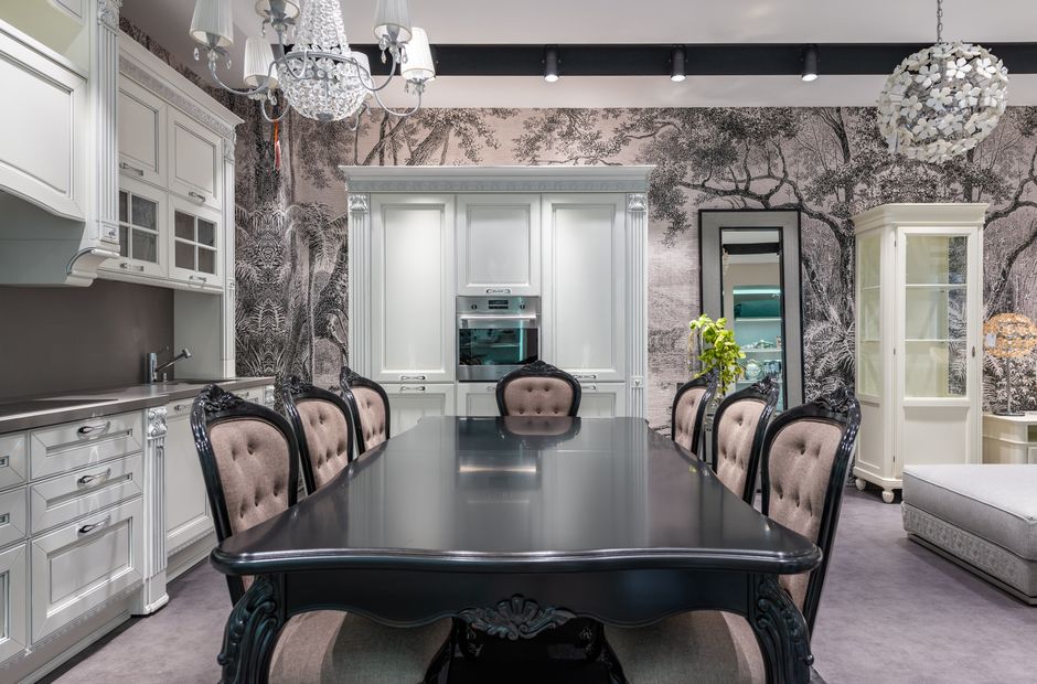
The success of combining paint and wallpaper relies on a thoughtful contrast or complementary relationship. One approach is to choose a bold paint color that shares an undertone with the wallpaper. For example, a deep burgundy paint can pair well with a dark, embossed wallpaper that has a bronze or coppery sheen. Another method is to use the wallpaper to provide a neutral backdrop for a vivid paint color on an adjacent wall or ceiling. A textured beige or gray wallpaper can ground the room, allowing a crimson or cobalt blue to stand out without feeling jarring.
It is also possible to reverse the emphasis: apply a bold paint color to most walls and reserve the textured wallpaper for a single feature wall behind a sideboard or buffet. This creates a focal point that draws the eye without saturating the entire room. The texture then serves as a visual relief, breaking up the flatness of the painted surface. When doing so, ensure that the paint color is not so intense that it competes with the wallpaper pattern; if the wallpaper has a pronounced texture, keeping the paint on the other walls slightly muted can maintain balance.
Another technique involves using the wallpaper on the ceiling. This can be particularly effective in a dining room where a chandelier or pendant light casts shadows upward. The ceiling becomes an unexpected surface of interest, while the walls are painted in a bold but complementary color. This layout can make the room feel both taller and more intimate, depending on the choice of texture and hue. Whatever combination is explored, testing samples side by side under the same lighting conditions is a recommended step before finalizing.
Creating a Cohesive Table Setting
The table setting is where the color and texture choices on the walls can be echoed or contrasted. A practical approach is to select table linens, dinnerware, and glassware that incorporate at least one color from the painted walls or wallpaper. This creates a visual link that ties the table to its surroundings. For instance, if the walls feature a bold teal paint and a subtle grasscloth wallpaper, using table napkins in a lighter aqua or a warm sand tone can bridge the two surfaces.
Texture on the table itself can be introduced through materials such as linen tablecloths, woven placemats, or ceramic plates with a matte finish. A smooth, glossy table surface can feel formal, while rough-hewn wood or stoneware adds a rustic touch. Balancing gloss and matte elements prevents the table setting from feeling one-dimensional. Silverware with a brushed finish or glassware with a slight ribbing can echo the tactile quality of the wall texture without replicating it exactly.
When arranging the table, consider the layering of textures. A single table runner in a textured fabric, paired with solid-color plates and cloth napkins, provides enough variety without clutter. The goal is to create a composition that feels intentional but not overly styled. Seasonal adjustments can also be made, such as switching to heavier fabrics in the fall or lighter weaves in the spring, allowing the dining room to evolve without a complete redesign.
Centerpiece Ideas That Complement the Scheme
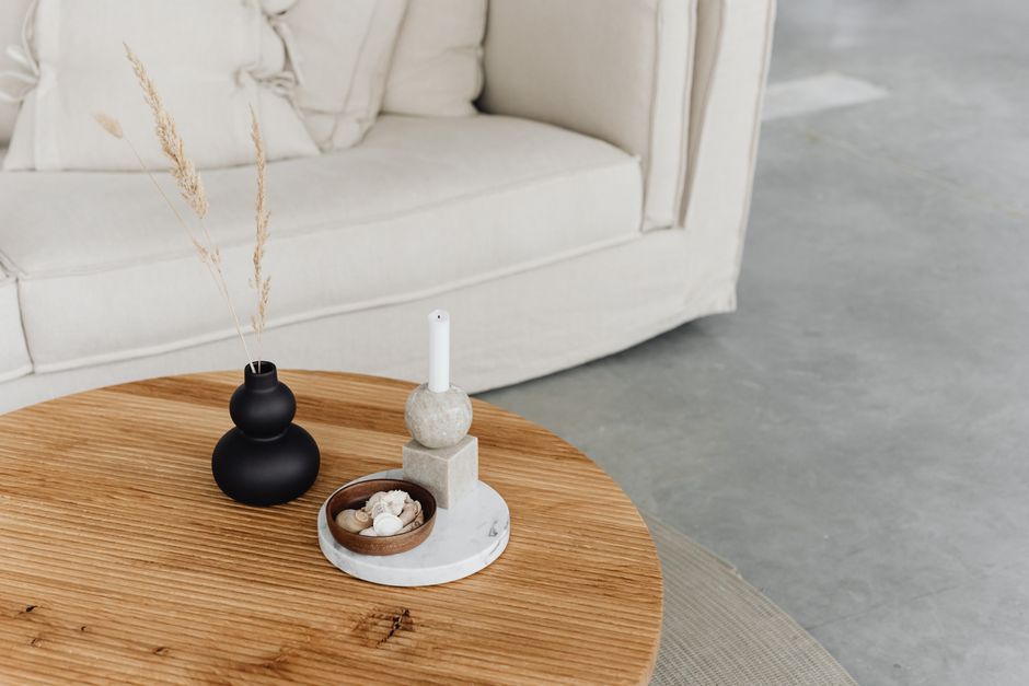
Centerpieces offer a final opportunity to reinforce the interplay of color and texture. A low arrangement of flowers, greenery, or dried branches can be placed in a vase that picks up a color from the wallpaper or paint. For example, a ceramic vase with a matte glaze in a similar shade to the wall color creates cohesion, while a vase with a metallic finish adds a contrasting reflective element that interacts with the table surface.
Another idea is to use natural elements such as driftwood, smooth stones, or sculpted coral, which bring in organic texture that resonates with materials like grasscloth or linen wallpaper. These items do not require frequent replacement and can remain as a constant element. For those who prefer a more structured look, a tiered tray or pedestal bowl filled with seasonal fruits or decorative gourds introduces both color and shape. The key is to keep the centerpiece low enough that it does not obstruct conversation across the table.
Lighting the centerpiece also matters. A small candle lantern or a cluster of votives in textured holders can cast soft shadows that highlight the table linens and wall texture. Candles with a matte finish or those housed in hammered metal holders add another layer of materiality. As with the rest of the design, the centerpiece should feel like a natural extension of the overall palette rather than an afterthought. Experimenting with different heights and groupings can help determine what feels most comfortable for the space.