Choosing a Warm Color Palette for Your Living Room
Warm colors have a natural ability to make a living room feel inviting and comfortable. Tones such as terracotta, gold, ochre, and rust are often associated with sunlight, earth, and fire, creating spaces that feel grounded and cozy. When selecting a warm color palette, it is helpful to consider how these hues interact with other elements in the room, including furniture, flooring, and lighting. The goal is not to achieve a specific outcome but to explore combinations that support the atmosphere you wish to cultivate.
Many homeowners find that warm tones can be used in different ways, from accent walls and textiles to accessories and artwork. The process involves understanding the undertones of each color and how they relate to the existing neutral pieces in the room. Neutral furniture, such as sofas in beige, cream, or gray, serves as a versatile backdrop that allows warm accents to stand out without overwhelming the space. This article outlines a step-by-step approach to selecting and balancing warm colors, focusing on practical considerations rather than rigid rules.
Before diving into specific shades, it is important to note that the perception of color changes with lighting conditions, room size, and personal preference. The methods described here are meant to guide exploration, not to prescribe a single correct answer. By approaching the selection process methodically, you can create a living room that feels cohesive and comfortable over time.
Understanding the Characteristics of Warm Tones
Warm colors are typically located on the red, orange, and yellow segments of the color wheel. Within this family, there is a wide range of saturation and lightness. Terracotta, for instance, is a muted reddish-brown that carries earthy undertones, making it less intense than pure red. Gold, on the other hand, tends to have a metallic quality that reflects light and adds a subtle sense of luxury. Ochre and rust offer variations in depth and warmth, with ochre leaning toward yellow and rust toward orange-brown.
The behavior of these colors depends on their value (how light or dark they are) and saturation (how vivid or muted). A highly saturated yellow may feel energetic, while a muted terracotta appears more subdued. When planning a palette, it is useful to select one dominant warm hue and then choose one or two complementary accents. For example, a living room with terracotta walls might incorporate gold in small decorative elements such as picture frames, throw pillows, or light fixtures. This approach prevents the room from feeling monochromatic while maintaining visual harmony.
Another factor to consider is the temperature of the warm tone itself. Some warm colors have cool undertones (e.g., a terracotta with a pinkish cast) while others have warm undertones (e.g., a rust shade with orange hints). Observing these subtleties can help when pairing with neutral furniture, as certain neutrals harmonize better with specific undertones. For instance, a beige sofa with warm yellow undertones pairs naturally with terracotta, while a cool gray sofa may require a warm accent that bridges the difference.
Choosing a Dominant Warm Shade for the Room
Selecting a primary warm color involves evaluating the existing architectural features, the amount of natural light, and the intended mood. South-facing rooms with abundant sunlight can handle deeper, richer shades like rust or burnt orange, as the light will soften their intensity. North-facing rooms, which receive cooler, indirect light, may benefit from lighter warm tones such as peach or warm beige to avoid making the space feel dark.
Terracotta is a popular choice because it offers a balance between warmth and neutrality. It works well in rooms with wood floors, natural fibers, and plants. Gold, while often used as an accent, can also be applied as a dominant color if used in a muted, chalky finish rather than a high-shine metallic. For those who prefer a bolder statement, ochre provides a sunny yet grounded alternative.
It is advisable to test paint samples on large pieces of poster board and observe them at different times of day before committing. This step helps reveal how the color changes under artificial light and how it interacts with the furniture and flooring. The goal is to find a shade that feels consistent with the overall desired atmosphere, not to predict a specific outcome. Each room responds differently, and the same color can look markedly different from one space to another.
Pairing Warm Colors with Neutral Furniture
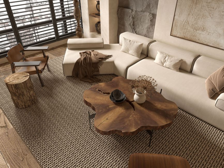
Neutral furniture acts as a stabilizing element that prevents warm colors from becoming too dominant. Sofas, armchairs, and tables in shades of cream, beige, taupe, or gray provide a resting point for the eye. One effective strategy is to use warm colors on the walls or as large textiles, while keeping upholstery neutral. For example, a cream-colored sectional in a room with terracotta walls creates a clean contrast that lets the wall color stand out without competition.
Another approach is to reverse the relationship: use neutral walls as a canvas and bring warmth through furniture and accessories. A living room with light gray walls might incorporate a terracotta sofa or a gold-and-cream area rug. This method allows for flexibility if you decide to change the accent colors later. In either scenario, the key is to distribute the warm tones in a way that feels balanced. A room that is entirely warm can feel overwhelming, while a room with too few warm accents may lack cohesion.
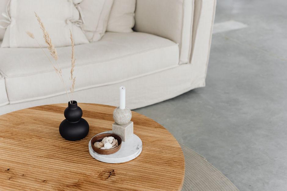
Texture also plays a crucial role in this pairing. Warm colors paired with natural materials like linen, wool, or wood tend to feel more harmonious. A gold accent pillow on a beige linen sofa, for instance, creates a subtle layering effect. Introducing metallic elements such as brass or copper fixtures can echo the gold tones without repeating them exactly. The goal is to create a layered environment where each element supports the overall palette.
Application Methods and Material Choices
Warm colors can be introduced through various surfaces and materials. Paint is the most straightforward method for walls, ceilings, or even a single accent wall. For those who prefer a less permanent option, removable wallpaper in a warm pattern offers flexibility. Textiles such as curtains, throw blankets, and pillows allow for seasonal adjustments, as they can be swapped out more easily.
Floor coverings, including rugs and carpet, provide another opportunity to incorporate warm tones. A terracotta-toned wool rug can anchor a seating area while complementing neutral sofas. Similarly, artwork with gold or ochre elements can tie the palette together without requiring large commitments. Lighting also influences how warm colors appear; bulbs with a warm color temperature (around 2700K to 3000K) enhance the richness of terracotta and gold, whereas cooler bulbs may wash them out.
Home Hue offers a range of interior paints that include warm shades suitable for living rooms. When selecting paint, it is useful to look at the brand’s color swatches in person and consider how they align with your furniture and lighting. The brand’s collections often include nuanced terracotta and gold options that can serve as starting points for your palette. However, the ultimate choice depends on your specific room conditions and personal taste.
Practical Steps for Testing and Adjusting
Before finalizing a color scheme, it is recommended to test combinations in the actual room. Paint small sections of the wall or use large swatches that can be moved around. Live with the samples for a few days, observing them in morning, afternoon, and evening light. Take note of how the colors interact with the neutral furniture and any existing decor. This process helps identify potential mismatches early, preventing costly changes later.
If the initial combination feels too intense, consider reducing the saturation of the warm color or adding more neutral surfaces. For instance, a room with deep rust walls may benefit from white trim and a light beige sofa to soften the contrast. If the palette feels too subdued, introduce a brighter accent such as a mustard yellow throw or a gold metallic vase. Adjustments can be made incrementally until the balance feels right.
Remember that color perception is subjective, and what works for one person may not work for another. The methods outlined here are intended to support a thoughtful decision-making process, not to guarantee a specific aesthetic outcome. By approaching the selection with curiosity and patience, you can develop a living room palette that reflects your preferences while maintaining a warm and welcoming atmosphere.